
Integrating date pickers
The following content is a free chapter of my bestselling book, Integrating Front End Components with Web Applications. Please do not re-publish this content without my permission.
Chapter 8 – Integrating Date Pickers
This chapter covers:
- Theory behind date pickers
- Practical examples of date pickers in action
- Using Pickadate open source library for a date picker
- Integrating date pickers with the back end
Date pickers play an important part of many modern web applications. Choosing the period of hotel stay, booking flights, specifying the length of events, reserving rental cars, selecting the range of admin reports, all of these are examples of website functionality that requires the user to choose a certain date or a range of dates.
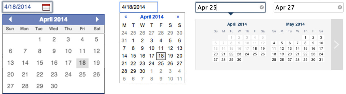
Date pickers used on popular websites
If the website is used by only one person – there is probably no need to integrate a date picker, just let the user type the date in an input field like this:
Simplest date picker – text input field
However, usually websites are used by more than one person visiting from more than one country and a need for a bit more complex in nature yet easy to use solution arises. (drum roll please…) The solution is to use date pickers. Date pickers make it painless and simple to navigate through a calendar to choose a date that the user has in mind. When the user is presented with choosing a date on a website, he or she will have the following questions that a date picker should be able to answer:
- In what format should I enter the date? (taking into account the local preferences of the user)
- Is next Friday the twelfth or the thirteenth? (visual representation of the calendar)
- What is today’s date? (clear hint of current date)
A good date picker front end solution offers compatibility with a wide range of languages, date formats, screen sizes and browsers. This chapter will focus on integrating one of the best open source plugins solving the problem of integrating a date picker, called Pickadate. When integrated with a web application, it looks like this, clean and minimal:
Full featured date picker with Pickadate plugin
You’ll gradually learn about date pickers and about integrating them in your applications as you read through this chapter. First you’ll learn about the basic theory behind date pickers, then you’ll be introduced to some existing open source projects providing date picker functionality, speficially you’ll meet Pickadate plugin in its full glory. Finally, you’ll integrate a date picker with a back end framework in a small application. Let’s get started by understanding the theory behind date pickers.
2.1 Theory behind date pickers
Most date pickers store user’s choice in a hidden input field. The reason for that is so that when the form containing this input is submitted to the server it would send the chosen date in a format that the back end would be able to understand. Consider asking the user to choose any date of the year. If instead of using a date picker the user would be required to type the answer in a text input field, some of the possible entries would be:
- April 18, 2014 (US format)
- 9 June, 2014 (European format)
- 04/18/2014 (US format)
- 18/04/2014 (European format)
- Next Monday (my favorite, lazy person format)
- A month from now (“I’m not Rainman, I don’t keep a calendar in my head!!!”)
- Today (“I am unemployed and have no idea what date it is”)
As you can see, there are many different formats that users around the world might use to choose a date. Without using a date picker this inconsistency could be disastrous when the form is submitted and the back end application tries to process the input. To alleviate this problem, most date pickers usually consist of two parts, an interface and a hidden input field. When the user interacts with the interface (opens a date picker, chooses a date, etc.), the hidden input field will contain the choice in a consistent format that could be understood by the back end. Figure 8.1 illustrates the interaction of the two components of a date picker, the interface and the hidden input field:
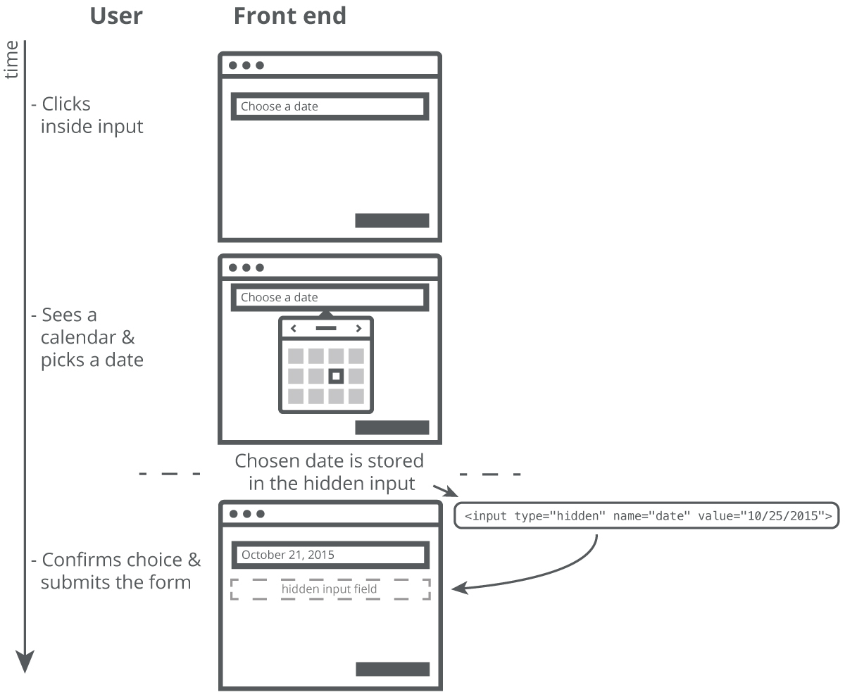
Figure 8.1 Interaction of the interface and the hidden input field
It will be important to double check that the value in the hidden input field is indeed a date in the desired format. When the form containing the hidden input field is submitted to the back end, the date input should be parsed to make sure that the user didn’t enter any malicious input and then the parsed/verified value could be stored in the database for further operations. Not having this verification could lead to security problems.
Can you make a date picker without hidden input field?
Some date pickers store the value in a text input field instead of using a hidden input field. While it is possible to do this, it is not as flexible and it is harder to constrain the format of user’s input.
There are many existing open source date picker libraries that make integrating a date picker into a straight forward process. In this chapter we will look at using just one library called “Pickadate”, but using any other library will follow similar concepts so you could easily pick up another one if
for some reason Pickadate does not satisfy your requirements. Here is a list of some of the best, well-designed and well-built date picker libraries:
- jQuery UI datepicker
- Bootstrap datepicker by Andrew Rowls
- Zebra Datepicker
- Datepicker by Stefan Petre
- Pickadate by Amsul
When choosing a date picker library it is important that it works with many different date formats, supports many languages, is easy to skin, and works with many screen sizes (responsive). Pickadate library was chosen for this book because it satisfies all of these requirements while staying very small in size.
Decode date pickers on the web
For the next week try to inspect date pickers on various websites by launching Chrome Developer Tools and looking at the HTML markup behind the date picker interface. Find the hidden input field that is affected when you choose different date and check the value it contains after your interaction with the date picker.
Now that you know the theory behind date pickers and know where to find great libraries providing this functionality, let’s start integrating a date picker in your web application.
2.2 Integrating Pickadate library
Pickadate is a very compact yet powerful date picker library. It weights only 8Kb in total including one of the two skins provided and has support for 38 languages. What makes this library different from the rest open source date pickers is its modern look (adapting to any screen size), great modular architecture and incredible user experience. It is hard to underestimate the importance of responsive design because so many websites need to be mobile-friendly and Pickadate gracefully fills this void present in other solutions. Enough talking, let’s start doing!
Due to its modular design, Pickadate library is broken up in a few Javascript components, a picker core (picker.js), a date picker (picker.date.js) and a time picker (picker.time.js). To integrate the date picker functionality of Pickadate library we need to include its core script – picker.js (also called base script in this library), its date picker script – picker.date.js and one of the provided themes.
The themes are also broken up in a few parts. There is a base CSS file for each theme, a date picker CSS file and time picker CSS file matching the theme. When the library is loaded on the page we will transform a simple input field into a great-looking date picker. You can download this library from one of the releases on Github: https://github.com/amsul/pickadate.js/releases
Whoa, time picker too?
While Pickadate library provides both, a time picker and a date picker, we will only use the date picker functionality in this chapter. When you are comfortable integrating the date picker integrating its time picker component will be trivial because these components share a lot of similar concepts.
2.2.1 Including Pickadate and its themes in your page
After the library is downloaded, let’s include it by loading it’s Javascript and one of the included themes. At the time of this writing there are two themes provided with the library: default and classic. Default theme uses a full-screen popup to show the date picker while the classic theme shows the date picker in a drop down menu that slides from under the input field. We will use the classic theme for this chapter. The image in figure 8.2 shows the visual difference between the two themes:
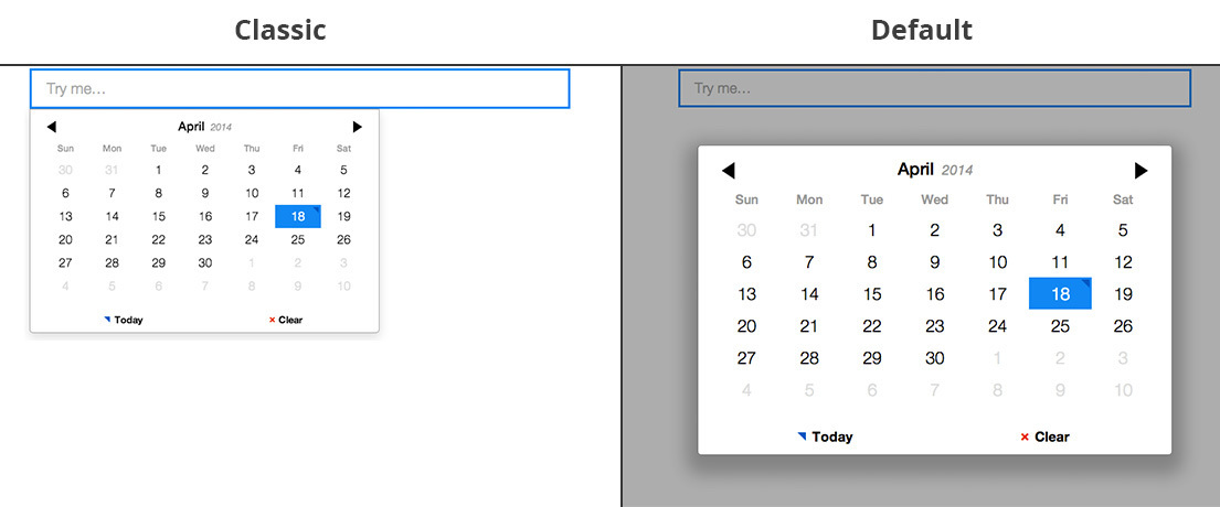
Figure 8.2 Themes included with Pickadate
Let’s include the compressed assets of Pickadate library. Include its CSS in the HEAD tag of your page and its JS before the closing BODY tag. Code in listing 8.1 shows the library’s assets included on a page and ready for use.
Listing 8.1 Including Pickadate library
<!DOCTYPE html>
<html>
  <head>
    ...
    <!-- Include library's base theme and date picker theme files -->
    <link href="vendor/pickadate/compressed/themes/classic.css" rel="stylesheet">
    <link href="vendor/pickadate/compressed/themes/classic.date.css" rel="stylesheet">
    ...
  </head>
  <body>
    ...
    <script src="http://code.jquery.com/jquery-1.10.2.min.js"></script>
    <!-- Include library's JS files -->
    <script src="vendor/pickadate/compressed/picker.js"></script>
    <script src="vendor/pickadate/compressed/picker.date.js"></script>
  </body>
</html>
Dependencies and browser support of Pickadate
Pickadate plugin requires jQuery to be present on your page in order to work. The plugin works with all modern browsers – and even IE8+. For IE8 support include legacy.js file that comes with the library.
Now that the library and one of its themes are included, we can use it on an input field and explore the different options available.
2.2.2 Enabling Pickadate
Let’s enable Pickadate on an input field that will serve as a date picker. Imagine that you have a form containing many different input fields and one of the necessary fields in the form is a text input field that should allow the user to choose a date on a calendar. Enabling Pickadate on this text field will do two things: create the date picker interface (initially hidden) and attach events that control the interface when the user clicks inside of the input field. Code in listing 8.2 below shows how to enable Pickadate date picker on a text input field inside of a form:
Listing 8.2 Enabling Pickadate on an input field
...
<form>
...
<input id="date" name="date" type="text" placeholder="Choose a date">
<input type="submit" value="Submit" class="btn btn-info btn-block">
</form>
...
<!-- After including the date picker scripts -->
<script>
$(function() {
// Enable Pickadate on an input field
$('#date').pickadate();
});
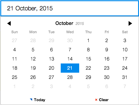
</script>When Pickadate is enabled on the input field, you can see the date picker in action by clicking inside of that input field. Screenshot in figure 8.3 below shows the effect of enabling Pickadate on the field:
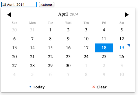
Figure 8.3 Pickadate enabled on an input field
There’s something interesting about invoking Pickadate this way, without any additional parameters. No hidden input will be created, but instead the chosen date will be stored as the actual value of the input field. Because the format of the chosen date (e.g. “18 April, 2014”) is standard enough to be submitted to the server there is no need to duplicate the input fields. The need for the hidden input field comes when you want the displayed date format to be different from the format of the value that is submitted to application’s back end. Let’s take a look at changing the date format of the submitted value.
2.3 Changing the date format
Most often, the date format of the submitted date picker value will be dictated by the back end requirements depending on what needs to be done with the chosen date. By default, the format of the date picker is set to ‘d mmmm, yyyy’, where ‘d’ is the date of the month (1-31), ‘mmmm’ is the full name of the month (e.g. January) and ‘yyyy’ is the year in full form (e.g. 2014). If you want to change the format of the value that will be submitted to the server you can pass that as ‘formatSubmit’ option to pickadate(). When this option is used, a hidden input field is created and it’s name is set to the name of the initial input field plus suffix of ‘_submit’. Code in listing 8.3 shows how instead of default date format you can set a format of ‘yyyy/mm/dd’ on the hidden input field:
Listing 8.3 Setting the date format of hidden input field
$(function() {
  // Enable Pickadate on an input field and
  // specifying date format for hidden input field
  $('#date').pickadate({
    formatSubmit : 'yyyy/mm/dd'
  });
});
When the form is submitted, it will now contain two input fields, one named ‘date’ and another one (hidden): ‘date_submit’. The format of the ‘date’ field will be the same as it was before, ‘d mmmm, yyyy’, but the format of ‘date_submit’ hidden input field will be ‘yyyy/mm/dd’, e.g ‘2014/04/18’. If you want to format the hidden input field differently, use the table 8.1 below (from Pickadate documentation) to understand how to format different components of the date: days, months and years:
Table 8.1 Formatting rules of Pickadate
| Rule | Description | Range |
|---|---|---|
| d | Date of the month | 1-31 |
| dd | Date of the month with a leading zero | 01-31 |
| ddd | Day of the week in short form | Sun – Sat |
| dddd | Day of the week in full form | Sunday – Saturday |
| m | Month of the year | 1 – 12 |
| mm | Month of the year with a leading zero | 01 – 12 |
| mmm | Month name in short form | Jan – Dec |
| mmmm | Month name in full form | January – December |
| yy | Year in short form | 00 – 99 |
| yyyy | Year in full form | 2000 – 2999 |
For example setting ‘formatSubmit’ option to MySQL datetime format would look like this:
// Setting format of the submitted value to conform to MySQL datetime format
formatSubmit : 'yyyy-mm-dd 00:00:00'
Now that you know how to change the date format of the hidden input field submitted to the back end, let’s take a look at changing the date on the front end.
2.3.1 Changing the date format of displayed value
To specify the format of the value that is displayed to the user after he or she chooses a date you can set the ‘format’ option to a desired date format. For example if you wanted to say “You chose Oct-25-2015” after the user chose a date, you would do it by passing ‘You chose mmm-dd-yyyy’ as the format option as you can see from code in listing 8.4:
Listing 8.4 Customizing format of displayed date
format : 'You chose mmm-dd-yyyy'Escaping ‘d’,’m’ and ‘y’ characters
If you need to use ‘d’, ‘m’, ‘y’ characters in the format string other than for the date format, you need to escape them by prepending an exclamation mark like this: ‘The !date is mm-dd-yyyy’. If you just put ‘The date is mm-dd-yyyy’ you will see something like ‘The 25ate is 10-25-2015’ which is probably not what you intend.
Now that you know how to set formats for both, the visible and the hidden input fields, let’s explore another area of Pickadate customization, changing the names of the input fields that will be sent to the server when the form containing the date picker is submitted.
2.4 Modifying input fields
There are a many options that Pickadate provides when it comes to naming the input fields that will be sent to the server. You can set an option to send only the hidden field (instead of the input field + hidden field), otherwise you can give the hidden field a custom name using a suffix and a prefix options. Let’s take a look at submitting just the hidden input first and then let’s learn how
to customize hidden input name if it is sent as an addition to the actual input field.
2.4.1 Making hidden input the only value submitted to the server
To send only the value contained in the hidden input you can set ‘hiddenName’ to true. Doing this will basically replace the original text input with the hidden input and will give the name of the original input to the hidden input. Code in listing 8.5 below shows how to enable this option along with custom format for the hidden field and the effect that it has on the HTML of the date picker:
Listing 8.5 Substituting real input field with the hidden field
$(function() {
  $('#date').pickadate({
    formatSubmit : 'yyyy-mm-dd 00:00:00',
    hiddenName : true
  });
});

// The HTML of the input fields when the form is submitted will contain:
<input id="date" name="" type="text" placeholder="Choose a date">
<input type="hidden" name="date" id="date_hidden" value="2015-10-25 00:00:00">
Use this by default
In my opinion, submitting only the formatted value is necessary for a date picker since what is displayed is not necessarily easy to parse by the server (especially when it comes to localization issues). Using these two options in listing 8.5 is a good start for integrating Pickadate.
2.4.2 Renaming the hidden input field
In those cases when you need to submit both values, the displayed and the hidden value, you can customize the name of the hidden input field by using ‘hiddenPrefix’ and ‘hiddenSuffix’ options. The ‘hiddenPrefix’ option sets a text string that will be prepended to the name of the hidden input. The ‘hiddenSuffix’ option sets a text string that will be appended to the name of the hidden input, as specified above this option is set to ‘_submit’ by default. For example if you wanted to have the name of the hidden input be “date_myfield”, you would name the original input field “date” and add the hiddenSuffix option with a value of ‘_myfield’, like it is shown in listing 8.6 below:
Listing 8.6 Changing the name of the hidden input field
$(function() {
  $('#date').pickadate({
    formatSubmit : 'yyyy-mm-dd 00:00:00',
    hiddenSuffix : '_myfield'
  });
});

// The HTML of the input fields when the form is submitted will contain:
<input id="date" name="" type="text" placeholder="Choose a date">
<input type="hidden" name="date_myfield" id="date_myfield" value="2015-10-25 00:00:00">
Great! You now are able to control the names and formats of the input fields that will be submitted with your form containing the date picker. We’ll see these concepts in action later on when we build the integration of a date picker with the back end so keep them as a reference. For now let’s take a look at setting a default value in the date picker upon page load.
2.5 Setting default value of the date picker
Setting the default value of the date picker could be done in a few ways depending on the formatting of the submitted date. If the date that will be displayed is the same as the date that will be submitted, nothing special needs to be done, just set the ‘value’ attribute of the input field, e.g. ‘April 18, 2014’ and you are good to go. In case when the submitted (hidden) value differs in formatting from the displayed value, you can set a default value of the input field by adding ‘data-value’ HTML attribute to the original input field and format its value according to the format of the submitted value (‘formatSubmit’). Code in listing 8.7 shows the latter, most common case when the default value needs to use the same format as the submitted value:
Listing 8.7 Setting the default value formatted as the submitted value
...
<input id="date" name="date" type="text" data-value="2015-10-25 00:00:00"
  placeholder="Choose a date">
...

<script>
$(function() {
  // Enable Pickadate on an input field using a custom format for submitted value
  $('#date').pickadate({
    formatSubmit : 'yyyy-mm-dd 00:00:00'
  });
});
</script>
Now when you load the page and click on the date picker you will see that by default it will be set to October 25, 2015 just like we wanted it to be (figure 8.4):
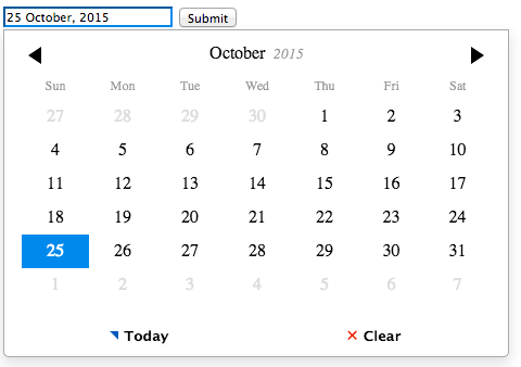
Figure 8.4 Setting data-value results in the pre-defined calendar setting
2.6 Changing the language used in the date picker
Pickadate comes with an easy way to switch the language and the defaults used to name days, months and to format dates to accomodate all users of your application. By including one of the provided language files (get them here) in the page where you use this date picker you can instantly change the locale used in the date picker.
As a fun example, let’s change the names of the months used in the calendar to Pirate-themed expressions. To do that, we’ll extend the defaults of the date picker and set the names of the months as an array passed to ‘monthsFull’ option. Code in listing 8.8 shows how with this simple addition before initializing the date picker you can instantly change the locale used in the date picker:
Listing 8.8 Changing the language used in the date picker
...
<form>
  <input id="date" name="date" type="text" placeholder="Choose a date, pirate">
  <input type="submit" value="Submit" class="btn btn-info btn-block">
</form>
...

<script>
  // Add custom names for the months
  jQuery.extend( jQuery.fn.pickadate.defaults, {
      monthsFull: [ 'Januarr!', 'Februahoy', 'Marr!ch', 'Ayepril', 'Mayday',
      'Jolly June', 'Julaye', 'Arr!gust', 'Septembrum', 'Octobrum', 'Novembrum', 'Decembrum' ]
  });

  $(function() {
    // Enable Pickadate on an input field
    $('#date').pickadate();
  });
</script>
With this simple addition, the date picker suddenly has a nice pirate feel to it, as you can see in the figure 8.5 below:
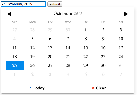
Figure 8.5 Pirate themed datepicker
The full list of options that you can customize in the plugin’s defaults is shown below in listing 8.9:
Listing 8.9 Localization options of Pickadate
jQuery.extend( jQuery.fn.pickadate.defaults, {
  monthsFull: [ ],   // Array of full month names, like 'January' ...
  monthsShort: [ ],  // Array of short month names, like 'Jan', 'Feb' ...
  weekdaysFull: [ ], // Array of full day names, like 'Monday', 'Tuesday' ...
  weekdaysShort: [ ],// Array of short day names, like 'Mon', 'Tue' ...
  today: '',         // String to be used to mark 'Today' button
  clear: '',         // String to be used to mark 'Clear' button
  firstDay: 1,       // First day of the week
  format: '',        // Default format of the displayed value
  formatSubmit: ''   // Default format of the submitted value
});
With this easy way to change localization options, adding your own languages to the plugin should now be trivial. Have fun creating your own date picker localizations! Now that you know how to set and change various options, set locale of the plugin and the default values, we can proceed with this chapter and implement a date picker in a small web application. With the knowledge you have gained up to this point it will not be a problem.
2.7 Building the back end for a date picker
Let’s build a complete application that will use a date picker to demonstrate the concepts you have learned in this chapter. The back end of this application will process the submission of a form containing a date picker and will do the following:
- If the date submitted is a valid date (i.e. the user didn’t put any malicious input), store the entry in the database
- If the date submitted is not a valid date, show an error message to the user.
Get the full application
Fully functional application source code is available on Github at https://github.com/msurguy/frontend-book/tree/master/ch8/complete-application. Feel free to install it and see it in action on your machine.
The algorithm of the whole application is illustrated in the diagram in figure 8.6 below:
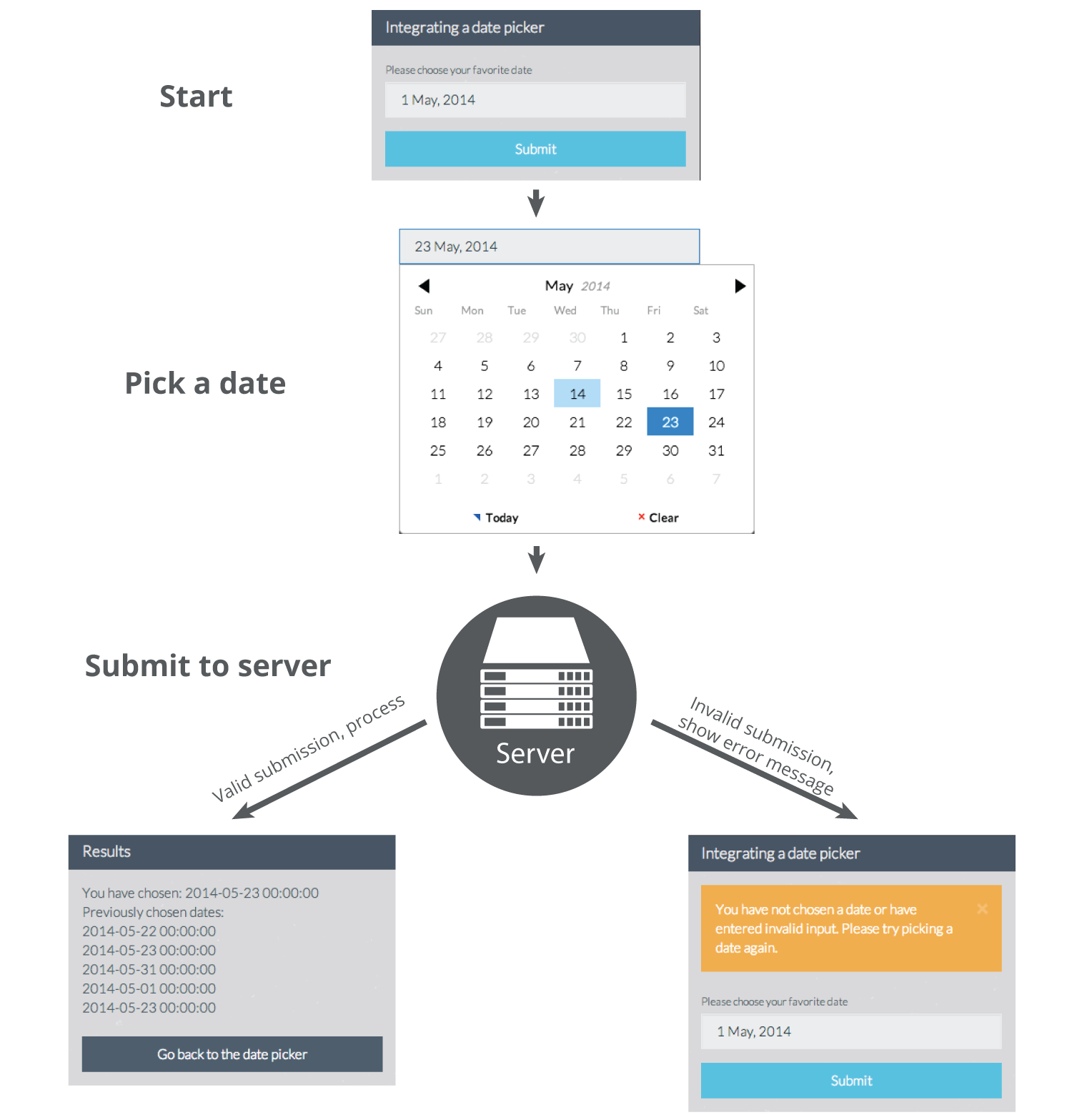
Figure 8.6 Diagram of the application
Using this application flow, let’s create simple route definitions, the DB structure of the application, view templates containing the date picker and finally, connect everything together into an application. Let’s get started by creating two simple routes that will contain all logic of the application.
2.7.1 Creating the route definitions
Like you’ve seen in other chapters of this book, the application containing a form will have a minimal amount of routes. Let’s create two routes, one that will show the form to the user and the other will process form submission. Code in listing 8.10 shows route definitions for these two application endpoints:
Listing 8.10 Route definitions for the application
// routes.php

// Show a page with a datepicker
Route::get('/', function()
{
  ...
});

// Process submission of the form containing the date picker
Route::post('/', function()
{
  ...
});
When the user navigates to the index route (“/”) of the application, we’ll display the date picker using Pickadate plugin. Submission of the form containing the date picker will execute the POST index route. All logic for the validation and processing of the form will be placed there. With these route placeholders in place, let’s now create the DB structure that will store user’s submissions.
2.7.2 Creating the database structure and the model
The DB structure for this application will be incredibly simple. We’ll only store the date that the user chooses and no other information beside the fields required by the back end framework (Laravel). The database structure for our table called “dates” will be as follows:
- id (autoincrementing integer, primary key)
- date (datetime)
- created_at (datetime)
- updated_at (datetime)
Let’s create a migration for this simple table. In the terminal run the following command while you are in the application’s root folder:
php artisan migrate:make create_dates_table
Running this command should create a file in “app/database/migrations” folder with a name “create_dates_table” in it. Open up this file and add the following migration definition to it (listing 8.11):
Listing 8.11 Migration for the ‘dates’ table
<?php

use IlluminateDatabaseSchemaBlueprint;
use IlluminateDatabaseMigrationsMigration;

class CreateDateTable extends Migration {

	public function up()
	{
		Schema::create('dates', function($table)
		{
		    $table->increments('id');
		    $table->dateTime('date');
		    $table->timestamps();
		});
	}

	public function down()
	{
		Schema::dropIfExists('dates');
	}
}
With this migration in place, let’s run the migration. Running the migration will create the DB structure for our application. Run the migration with the following command in the Terminal:
php artisan migrate
Configure DB settings
Before running the migration make sure you configured the DB settings in “app/config/database.php” file
Creating a model will allow us to work with the “dates” table as we would with any other objects in PHP. Let’s go ahead and create “Date” model by placing the contents of code in listing 8.12 into a file called “Date.php” in “app/models” folder:
Listing 8.12 Model for the ‘dates’ table
// app/models/Date.php
<?php

class Date extends Eloquent{}
With the database configured, the table created and the model defined, we can now create the templates that will make up the user interface (front end) of the application.
2.7.3 Creating the front end
There will be two view templates, one that shows a date picker (and an error if there is any) and another one that shows the results of the form submission. Let’s create the first template by using Pickadate plugin. We’ll set the format of the submitted value to MySQL datetime-friendly format and will assign a default date to show in the date picker to be May 1st, 2014. Code in listing 8.13 shows the Blade template for the index page (store it in “app/views/index.blade.php”):
Listing 8.13 Index page view template
@extends('layout')

@section('styles')
  {{ HTML::style('vendor/pickadate/compressed/themes/classic.css') }}
  {{ HTML::style('vendor/pickadate/compressed/themes/classic.date.css') }}
@endsection

@section('content')
<div class="row centered-form">
  <div class="col-xs-12 col-sm-12 col-md-4 col-sm-offset-2 col-md-offset-4">
    <div class="panel panel-default">
      <div class="panel-heading">
        <h3 class="panel-title">Integrating a date picker</h3>
      </div>
      <div class="panel-body">

        {{ Form::open() }}

          <div class="form-group">
            <label for="date">Please choose your favorite date</label>

            <input id="date" name="date" type="text" data-value="2014-05-01 00:00:00" class="form-control" placeholder="Pick one...">
          </div>

          <input type="submit" value="Submit" class="btn btn-info btn-block">

        {{ Form::close() }}
      </div>
    </div>
  </div>
</div>
@stop

@section('scripts')
  {{ HTML::script('vendor/pickadate/compressed/picker.js') }}
  {{ HTML::script('vendor/pickadate/compressed/picker.date.js') }}
  <script type="text/javascript">
    $( '#date' ).pickadate({
      formatSubmit : 'yyyy-mm-dd 00:00:00',
      hiddenName: true
    });
  </script>
@stop
Layout template used in the application
The layout Blade template for the application (“app/views/layout.blade.php”) can be retrieved from the source on Github here
With the index page complete, let’s switch to the results page. When the form is submitted and validated properly, we would like to show the value that user has submitted along with a list of all previously submitted values. Let’s call this template “results.blade.php” and place it in “app/views” folder. We will place a loop iterating over an array of objects containing previous user submissions along with the value that the user just chose. Code in listing 8.14 shows the complete Blade template for the results page:
Listing 8.14 Results page view template
@extends('layout')

@section('content')
<div class="row centered-form">
  <div class="col-xs-12 col-sm-12 col-md-4 col-sm-offset-2 col-md-offset-4">
    <div class="panel panel-default">
      <div class="panel-heading">
        <h3 class="panel-title">Results</h3>
      </div>
      <div class="panel-body">
        You have chosen: {{ $date }}<br>

        Previously chosen entries:<br>
        @foreach($dates as $entry)
          {{ $entry->date }}</br>
        @endforeach
        <br>

        <a href="{{ url('/') }}" class="btn btn-default btn-block">Go back to the date picker</a>
      </div>
    </div>
  </div>
</div>
@stop
With the view templates created we can now focus on adding actual logic in the application. Let’s place that in the routes that we defined previously.
2.7.4 Adding the logic
The GET index route should just show us the index page. The POST route will retrieve the form submission, confirm that the date submitted is indeed a date and then store the submission in the database. Let’s complete the GET index route first. Code in listing 8.15 shows that we only need to render the “index.blade.php” template when the user navigates to the index page of the application:
Listing 8.15 GET Index route completed
// Show a page with a datepicker
Route::get('/', function()
{
  return View::make('index');
});
The POST index route is where the magic of date validation and processing happens. This route will contain the following logic (listing 8.16):
Listing 8.16 POST Index route
// Process submission of the form containing the date picker
Route::post('/', function()
{
  // Get user's input

  // Validate input
  if(/* date isn't empty && date is valid */){
    // Create a new entry in the DB using Eloquent ORM
    // Retrieve all previously submitted dates
    // Display the results page, passing the date that the user has submitted
    // and all dates previously submitted
  } else {
    // Redirect to index page with an error notification when input isn't valid
  }
});
Great. The skeleton of the route tells us that we should check if the date is valid but there is no built-in method in PHP to do that if we provide a string formatted as MySQL datetime field. To validate the date in PHP and make sure it is in MySQL datetime format let’s use this little function (place it in routes.php for example):
Listing 8.17 Date validator
// A helper function to determine if date input is valid or not
function validateDate($date, $format = 'Y-m-d H:i:s')
{
  $d = DateTime::createFromFormat($format, $date);
  return $d && $d->format($format) == $date;
}
Now we can use this function to determine if the input that the user provided is indeed a date and not some malicious SQL injection. Let’s put this all together and complete the POST index route. Code in listing 8.18 shows the POST index route containing the logic to gather and verify user’s input. When the input validates, the application will create a new entry in the “dates” table, otherwise an error message will be passed to the index page of the application:
Listing 8.18 Complete route definition for the POST index route
// Process submission of the form containing the date picker
Route::post('/', function()
{
  // Get user's input
  $date = Input::get('date');

  // Validate input
  if($date != '' && validateDate($date)){
    // Create a new entry in the DB using Eloquent ORM
    $newDate = new Date;
    $newDate->date = $date;
    $newDate->save();

    // Retrieve all previously submitted dates
    $dates = Date::all();

    return View::make('result', ['date' => $date, 'dates' => $dates]);
  } else {
    // Redirect to index page with an error notification when input isn't valid
    return Redirect::to('/')->with('invalid_date', true);
  }
});
The last step that is required is to actually show the error message to the user. Let’s add the following code in the “index.blade.php” file before opening the form tag (listing 8.19):
Listing 8.19 Showing the error messages to the user
...
<div class="panel-body">

  @if(Session::has('invalid_date'))
    <div class="alert alert-warning alert-dismissable">
      You have not chosen a date or have entered invalid input. Please try picking a date again.
    </div>
  @endif

{{ Form::open() }}
...
That’s it! With this code in place we now have a fully functional application that uses a date picker to assist the user with choosing a particular date. You can now take advantage of all features of Pickadate plugin and modify its options to suit your application.
Check out completed application
The complete application is hosted online and is available at this URL: http://books.maxoffsky.com/frontend/ch8. Enjoy!
In this chapter you have learned a great deal about date pickers. You have learned the theory behind using a date picker to help the user choose a date and store it in a format that your application will understand. In the process you have met a great responsive library for integrating date pickers called “Pickadate” and have explored its many options of formatting the date, changing the looks and localizing it to fit your application’s audience. Finally, you have applied the skills from this chapter to build a fully functional back end application that integrates a date picker. With the knowledge acquired it will be now easy to use other date pickers and integrate a time picker that comes with Pickadate.
In the next chapter of the book we will shift the gears a bit and get into more advanced topics such as AJAX file uploads. You’ll meet one of the greatest libraries providing AJAX file upload functionality and photo cropping/resizing.
Get the Book NOW to read the rest