Integrating Bootstrap HTML/CSS Framework with web applications
This post is an excerpt from my bestselling e-Book called “Integrating Front End Components with Web Applications“.
Using Bootstrap 3 HTML/CSS/JS framework
Almost any web developer that has made a website or two has heard of Bootstrap framework. Bootstrap is a frontend framework that provides the necessary CSS and Javascript to make your websites responsive and nice looking. A clear advantage of using Bootstrap is that it accelerates web development process by letting you focus on building the application’s functionality instead of tinkering with (hopefully) cross-browser load of styling rules and media queries.
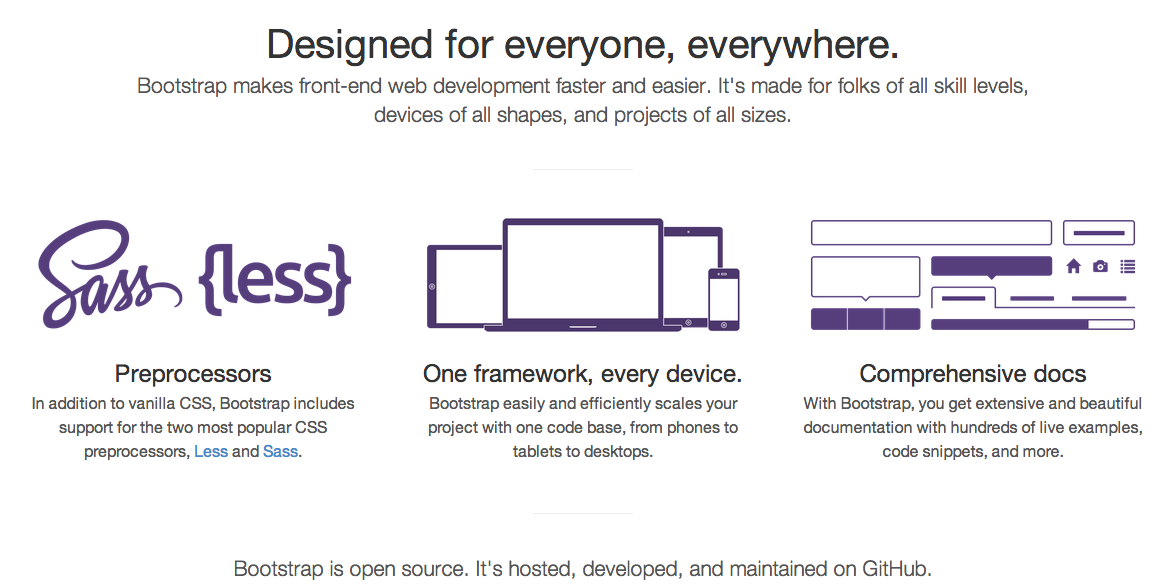 Bootstrap has been gaining a lot of popularity in the last two years which at the same time results in many websites looking alike. While it is a great framework to quickly build a prototype of a website or an admin panel for a website, it is highly encouraged to customize Bootstrap. You can do that by either using themes from Bootswatch, using a template from Creative Market or using other tools from this list.
Bootstrap theme used in this tutorial
The examples in this tutorial will be using a Bootstrap scheme from Bootswatch called “Superhero”. You can preview it here: http://bootswatch.com/superhero/.
To get started with using Bootstrap in your web application (not necessarily Laravel specific) you need to either:
- Use a CDN (Content Delivery Network) like Bootstrap CDN to serve the Bootstrap CSS/JS files
- Download Bootstrap CSS/JS and serve it from your application’s public folder
Let’s take a look at using the two methods of serving Bootstrap CSS and Javascript.
Using a CDN to serve Bootstrap CSS/JS
Serving Bootstrap from a Content Delivery Network (CDN) could make your website perform faster. It is a good practice to serve static assets (CSS/JS files) from a CDN when you have a lot of users all over the world. Modern CDNs have servers in multipler locations around the world and so that cuts down the time that it takes to serve the CSS and Javascripts assets to the user’s browser. With Bootstrap’s growing popularity there are now a few CDNs that serve Bootstrap CSS and JS for free. The most prominent and dependable of these is Bootstrap CDN located at http://www.bootstrapcdn.com from the generous folks at MaxCDN.
You can use BootstrapCDN to easily add Bootstrap stylesheets and javascript into your project. By adding just two lines of code from listing 1.1 you can take advantage of using a CDN to serve Bootstrap CSS and JS to your users:
Listing 1.1 inserting Bootstrap CSS and JS in your project
<link href="//netdna.bootstrapcdn.com/bootstrap/3.1.0/css/bootstrap.min.css" rel="stylesheet">

<script src="//netdna.bootstrapcdn.com/bootstrap/3.1.0/js/bootstrap.min.js"></script>
Using a specific version of Bootstrap
Bootstrap CDN allows you to choose a specific version of Bootstrap. For the newest version be sure to go to the homepage: http://www.bootstrapcdn.com/. For the older versions check out the “legacy” tab on the Bootstrap CDN website: http://www.bootstrapcdn.com/#legacy_tab
Using a different theme for Bootstrap
Bootstrap CDN also allows you to choose a specific theme of Bootstrap from Bootswatch instead of default Bootstrap. To see the list of all themes available for use on Bootstrap CDN, check the Bootswatch tab: http://www.bootstrapcdn.com/#bootswatch_tab
Please note, Bootstrap’s Javascript requires jQuery to be loaded first so if you want to use any of Bootstrap’s features like modal windows, dropdowns, etc. you would have to make sure to provide jQuery before loading bootstrap.min.js file.
A page that incorporates the Bootstrap framework served from BootstrapCDN is provided in Listing 1.2 below:
Listing 1.2 HTML page that uses Bootstrap from a CDN:
<!DOCTYPE html>
<html lang="en">
  <head>
    <meta charset="utf-8">
    <meta http-equiv="X-UA-Compatible" content="IE=edge">
    <meta name="viewport" content="width=device-width, initial-scale=1">
    <title>View Template that use Bootstrap</title>

    <!-- Bootstrap CSS served from a CDN -->
    <link href="//netdna.bootstrapcdn.com/bootstrap/3.1.0/css/bootstrap.min.css"
    rel="stylesheet">
  </head>

  <body>

    <div class="container">
      <div class="row">
        <h2>This template is using Bootstrap from a CDN!</h2>
      </div>
    </div>

    <script src="https://code.jquery.com/jquery-1.10.2.min.js"></script>
    <script src="//netdna.bootstrapcdn.com/bootstrap/3.1.0/js/bootstrap.min.js"></script>
  </body>
</html>
Another option to serve Bootstrap to the user’s browser instead of using a CDN is to store its stylesheets and javascript in the application’s “public” directory. The public directory is the root directory that is accessible to users when they go to your website.
Using self-hosted Bootstrap CSS/JS with back end framework
The concepts explained below could be adapted to other frameworks and not limited to Laravel that I will be using in the examples. The particular methods of each backend framework (Laravel, Symfony, Node.js, etc) are different but the concepts below apply to all MVC frameworks. To serve Bootstrap from your web application instead of using CDN you first need to download Bootstrap CSS, icon fonts and JS files, place them somewhere in the application’s “public” folder – the one that will be visible from the internet – and reference them in the your view templates.
You can download Bootstrap either from http://getbootstrap.com or by using Bower. When you download Bootstrap, you will find these three directories:
- css (compressed and the original css)
- js (compressed and the original js)
- fonts (glyphicons, the icon font that Bootstrap uses)
Cut and paste these directories into the “public” folder of your application, so that you have the following directory structure:
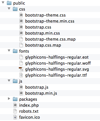
Then after you have the necessary CSS, JS and the Fonts in your application’s “public” folder, you can use Bootstrap just like you would if you used a CDN. The only change that you would need would be the location of the assets. For example in Laravel by using Laravel’s HTML generators, you can link to the CSS and JS files in a way shown in listing 1.3 below:
Listing 1.3 Using Laravel HTML helpers to link to Bootstrap CSS and JS files
{{ HTML::style('css/bootstrap.min.css') }}

{{ HTML::script('js/bootstrap.min.js') }}
You can use these two lines of code in listing 1.3 to add Bootstrap to your Blade layouts or Blade views. For example, a complete Blade view that uses this self-hosted method of referencing to Bootstrap is provided below in listing 1.4:
Listing 1.4 Blade view that uses Bootstrap located locally
<!DOCTYPE html>
<html lang="en">
  <head>
    <meta charset="utf-8">
    <meta http-equiv="X-UA-Compatible" content="IE=edge">
    <meta name="viewport" content="width=device-width, initial-scale=1">
    <title>View Template that use Bootstrap</title>

    <!-- Referencing Bootstrap CSS that is hosted locally -->
    {{ HTML::style('css/bootstrap.min.css') }}
  </head>

  <body>

    <div class="container">
      <div class="row">
        <h2>This template is using locally hosted Bootstrap!</h2>
      </div>
    </div>

    <script src="https://code.jquery.com/jquery-1.10.2.min.js"></script>

    <!-- Referencing Bootstrap JS that is hosted locally -->
    {{ HTML::script('js/bootstrap.min.js') }}
  </body>
</html>
These two easy methods of referencing Bootstrap’s assets (CDN and self-hosted) in Laravel allow you to use all the nifty features that come with Bootstrap: responsive layouts, good looking forms, buttons, button groups, modal windows and many many more. Let’s build upon the concept you have learned so far and use Bootstrap to create some nice looking registration and login forms for our applications!
Creating HTML for the registration and login page
Every web application that asks user to register needs a nice registration page and login page. Using Bootstrap building out the pages with responsive forms is not complicated. Over the course of the next few pages you will build a registration and login forms that you then will convert to Blade templates for usage in your applications.
You will get excited when you see what you will build. Here is the resulting look of the registration page that uses Bootstrap with this tutorial’s default Bootstrap theme called “Superhero”:
Looks awesome, don’t you think? Let’s build this good-looking registration using Bootstrap that we will serve from the Bootstrap CDN.
Building a registration form
First of all, we will use a nice background pattern for the login form. You can find hundreds of great looking backgrounds on Subtle Patterns website. For the forms that match our “Superhero” theme the pattern called “Stardust” works very well. Download and extract that pattern from https://www.toptal.com/designers/subtlepatterns/stardust/ and put the main (not @2x) file in the “img” folder inside of the “public” folder.
Getting patterns from Subtle Patterns
Subtle patterns website can be incredibly helpful when you need to find a great looking repeating (seamless) pattern for your web design projects in normal and high resolution. Make sure to check out the full range of patterns that they offer and check with the site’s license about using them on commercial projects.
Let’s define what elements the form will be composed of. The registration form will consists of a few input fields wrapped inside Bootstrap’s panel element:
- First Name (of type “text”)
- Last Name (“text”)
- Email (“text”)
- Password (type “password”)
- Password Confirmation (“password”)
- Submit button (full length)
As far as sizing, the responsive registration form will be 4 columns wide on medium to large screen, 8 columns on extra small to small and 12 columns on anything less than extra small screen size. You can consult with the following Bootstrap Docs page about the different screen sizes and column naming: http://getbootstrap.com/css/#grid. To center the form on the screen we can use Bootstrap grid’s offset methods such as “col-md-offset-4”.
The registration form will use small input field font size (Bootstrap’s “input-sm” class) so that the placeholders fit nicely inside the form. When put all together, the form’s HTML will look like the listing 1.5 below:
Listing 1.5
<div class="row">
  <div class="col-xs-12 col-sm-8 col-md-4 col-sm-offset-2 col-md-offset-4">
    <div class="panel panel-default">
      <div class="panel-heading">
        <h3 class="panel-title">Please sign up <small>It's free!</small></h3>
      </div>
      <div class="panel-body">
        <form role="form">
          <div class="row">
            <div class="col-xs-6 col-sm-6 col-md-6">
              <div class="form-group">
                <input type="text" name="first_name" class="form-control input-sm" placeholder="First Name">
            </div>
            </div>
            <div class="col-xs-6 col-sm-6 col-md-6">
              <div class="form-group">
                <input type="text" name="last_name" class="form-control input-sm" placeholder="Last Name">
              </div>
            </div>
          </div>

          <div class="form-group">
            <input type="email" name="email" class="form-control input-sm" placeholder="Email Address">
          </div>

          <div class="row">
            <div class="col-xs-6 col-sm-6 col-md-6">
              <div class="form-group">
                <input type="password" name="password" class="form-control input-sm" placeholder="Password">
              </div>
            </div>
            <div class="col-xs-6 col-sm-6 col-md-6">
              <div class="form-group">
                <input type="password" name="password_confirmation" class="form-control input-sm" placeholder="Confirm Password">
              </div>
            </div>
          </div>

          <input type="submit" value="Register" class="btn btn-info btn-block">

        </form>
      </div>
    </div>
  </div>
</div>
To make the form even prettier and make it stand out, let’s use CSS to add some transparency to the panel and a shadow on the right side of it. Also we would need a bit of a margin between the top of the form and top of the page. We will create a new CSS class called “centered-form” and append it to the DIV enclosing the whole form:
Listing 1.6 Addition of ‘centered-form’ class to the DIV enclosing the form
<div class="row centered-form">
  <div class="col-xs-12 col-sm-8 col-md-4 col-sm-offset-2 col-md-offset-4">
    <div class="panel panel-default">
    ...
Finally, create the CSS for transparency and top margin (listing 1.7):
Listing 1.7 CSS that adds top margin, transparency & shadow to the registration form
<style>
.centered-form .panel{
  background: rgba(255, 255, 255, 0.8);
  box-shadow: rgba(0, 0, 0, 0.3) 20px 20px 20px;
}

.centered-form{
  margin-top: 60px;
}
</style>
Now with this CSS in place, the full contents of the HEAD tag that enable the use of Bootstrap, add a pattern to the page and make our form a bit more better looking, is in the listing 1.8 below:
Listing 1.8 Full CSS for the registration form
<link href="//netdna.bootstrapcdn.com/bootswatch/3.1.0/superhero/bootstrap.min.css" rel="stylesheet">
<style>
body{
  background: url("img/stardust.png");
}

.centered-form .panel{
  background: rgba(255, 255, 255, 0.8);
  box-shadow: rgba(0, 0, 0, 0.3) 20px 20px 20px;
}

.centered-form{
  margin-top: 60px;
}
</style>
When the HTML from listing 1.5 and CSS from listing 1.8 are put together, the registration form should look like the the one in the picture below:

Now that we have the registration form complete, let’s build a login form in a similar fashion.
Building a login form
The login form will now be a breeze to build, with the existing registration form HTML and CSS from the previous section. With a few minor changes in the markup of the registration form, you will have a beautiful Login form that looks like this: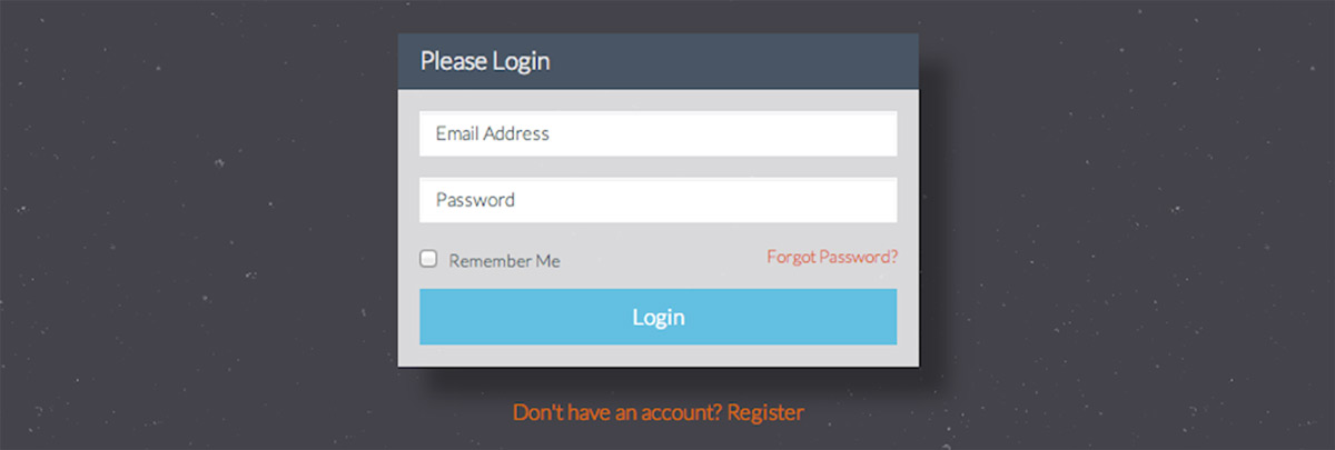
To create this nice looking responsive form, let’s define what input fields we want to have:
- Email (or username)
- Password
- Checkbox for “Remember me” feature
- Submit button
Also, we would like the user to be able to go to the registration form if they don’t have an account and a link to “Forgot password” feature if they don’t remember their password. With these input fields in mind, the complete HTML for the login form will look like the code in listing 1.9:
Listing 1.9 HTML of the login form
<div class="row centered-form">
  <div class="col-xs-12 col-sm-8 col-md-4 col-sm-offset-2 col-md-offset-4">
    <div class="panel panel-default">
      <div class="panel-heading">
        <h3 class="panel-title">Please Login</h3>
      </div>
      <div class="panel-body">
        <form role="form">

          <div class="form-group">
            <input type="email" name="email" class="form-control input-sm" placeholder="Email Address">
          </div>

          <div class="form-group">
            <input type="password" name="password" class="form-control input-sm" placeholder="Password">
          </div>

          <div class="checkbox">
            <label>
              <input name="remember" type="checkbox" value="Remember Me"> Remember Me
              <a href="/forgot" class="pull-right">Forgot Password?</a>
            </label>
          </div>

          <input type="submit" value="Login" class="btn btn-info btn-block">

        </form>
      </div>
    </div>
    <div class="text-center">
      <a href="/register" >Don't have an account? Register</a>
    </div>
  </div>
</div>
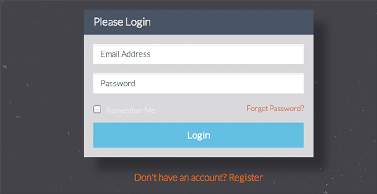
When this HTML markup is rendered in the browser, the login form will look like the following image:
Notice that the “Remember me” text is not clearly visible. Let’s fix that by adding a line of “color” CSS for “.centered-form .panel” that will change the color of the text and the labels on the login form:
.centered-form .panel{
  background: rgba(255, 255, 255, 0.8);
  box-shadow: rgba(0, 0, 0, 0.3) 20px 20px 20px;
  color: #4e5d6c;
}
When the css is updated with that extra line, the HEAD tag of the page where this form resides will look like the listing 1.10 below:
Listing 1.10 Full CSS for the login form
<link href="//netdna.bootstrapcdn.com/bootswatch/3.1.0/superhero/bootstrap.min.css" rel="stylesheet">
<style>
body{
  background: url("img/stardust.png");
}

.centered-form .panel{
  background: rgba(255, 255, 255, 0.8);
  box-shadow: rgba(0, 0, 0, 0.3) 20px 20px 20px;
  color: #4e5d6c;
}

.centered-form{
  margin-top: 60px;
}
</style>
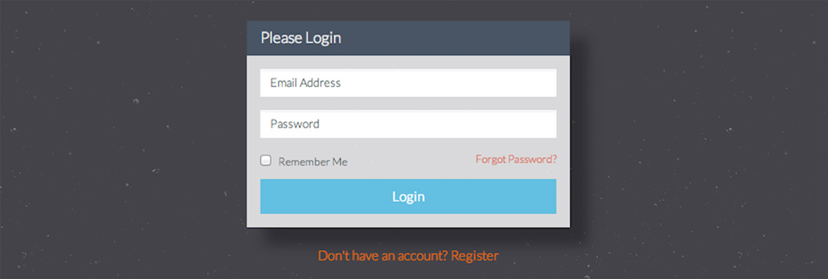
With that CSS in place, the login form is now complete and will render with the label text colored correctly, producing this beautiful screen that invites the user to log in into your awesome application:
Later in this tutorial we will convert the registration form and the login form into Blade templates that you could easily reuse in Laravel. What if you don’t like the color scheme that we are using for the projects in the tutorial (“Superhero” theme)? Don’t fear, there are so many other cool Bootstrap schemes available on Bootstrap CDN that you can use to change the look of the interface. For example, here is the same login form using Cerulean, Cosmo or Yeti styles:
And the same login form again, but using Readable, Journal or Flatly scheme:
If you wanted to use any of those different schemes for Bootstrap, all you would have to do is replace a single line in your HEAD tag requesting a different Bootstrap scheme from Bootstrap CDN (in this case, “Yeti” scheme that looks a bit like Foundation framework):
Using a different Bootstrap scheme for the whole page
<link href="//netdna.bootstrapcdn.com/bootswatch/3.1.0/yeti/bootstrap.min.css" rel="stylesheet">Again, as mentioned before, you can take a look at different schemes provided by Bootstrap CDN at http://www.bootstrapcdn.com/#bootswatch_tab. There are plenty of choices but if you still don’t like what you see there, it is encouraged to customize Bootstrap to your own liking.
Converting the registration and login forms to Laravel Blade templates
What do you need to do in order to convert the registration and login forms to templates compatible with Laravel or other backend framework? First, you will want to create a layout, like Blade layout to store the HTML that is common to more than one page of your application. Then you will convert the form input elements to your framework’s form methods. Laravel has “Form” methods (http://laravel.com/docs/html) that make that process simple. Last step is to add some highlighting for the errors that might arise when the validation of the forms doesn’t pass after submittal.
If you are using any backend framework, creating HTML layout template helps you separate the code that is common to two or more pages of your application. Laravel’s Blade templating makes it easy to then use that layout in other pages that will apply the layout as their “skin”. Using a common layout is incredibly beneficial when you want to make updates to all pages without going through all of the view files.
Let’s start the form conversion process by creating a layout template that will store the common HTML/CSS of both, registration and login forms. From the two HTML pages we can identify that the following areas of both forms have the same code:
Listing 1.11 Layout template starter
<!DOCTYPE html>
<html lang="en">
  <head>
    <meta charset="utf-8">
    <meta http-equiv="X-UA-Compatible" content="IE=edge">
    <meta name="viewport" content="width=device-width, initial-scale=1">
    <title>Using a Blade layout</title>

    <!-- Bootstrap CSS served from a CDN -->
    <link href="//netdna.bootstrapcdn.com/bootswatch/3.1.0/superhero/bootstrap.min.css"
    			rel="stylesheet">
    <style>
    body{
      background: url("img/stardust.png");
    }

    .centered-form .panel{
      background: rgba(255, 255, 255, 0.8);
      box-shadow: rgba(0, 0, 0, 0.3) 20px 20px 20px;
      color: #4e5d6c;
    }

    .centered-form{
      margin-top: 60px;
    }
    </style>
  </head>

  <body>

    <div class="container">
      ...
    </div>

    <script src="https://code.jquery.com/jquery-1.10.2.min.js"></script>
    <script src="//netdna.bootstrapcdn.com/bootstrap/3.1.0/js/bootstrap.min.js"></script>
  </body>
</html>
The section of the code with “…” shows a placeholder for the forms themselves. In Laravel, to use a layout placeholder you use “@yield(‘someSection’)” to specify a part of the layout that will be injected with content placed in a Blade template that is rendered. Let’s put a placeholder for “content” section and save the code listed below in a file “layout.blade.php” in the “app/views” folder:
Listing 1.12 Contents of app/views/layout.blade.php
<!DOCTYPE html>
<html lang="en">
  <head>
    <meta charset="utf-8">
    <meta http-equiv="X-UA-Compatible" content="IE=edge">
    <meta name="viewport" content="width=device-width, initial-scale=1">
    <title>Using a Blade layout</title>

    <!-- Bootstrap CSS served from a CDN -->
    <link href="//netdna.bootstrapcdn.com/bootswatch/3.1.0/superhero/bootstrap.min.css"
    			rel="stylesheet">
    <style>
    body{
      background: url("img/stardust.png");
    }

    .centered-form .panel{
      background: rgba(255, 255, 255, 0.8);
      box-shadow: rgba(0, 0, 0, 0.3) 20px 20px 20px;
      color: #4e5d6c;
    }

    .centered-form{
      margin-top: 60px;
    }
    </style>
  </head>

  <body>

    <div class="container">
      @yield('content')
    </div>

    <script src="https://code.jquery.com/jquery-1.10.2.min.js"></script>
    <script src="//netdna.bootstrapcdn.com/bootstrap/3.1.0/js/bootstrap.min.js"></script>
  </body>
</html>
With this layout template in place, we can easily create the templates for registration and login forms without repeating this code over and over again. Let’s create a Blade template for the registration form and save it as “registration.blade.php” file in “app/views” folder. To apply the layout template we created earlier, we will just use “@extends(‘layout’)” statement and specify which part of the template will be acting as “content” that will be inserted in place of “@yield(‘content’)”:
Listing 1.12 Contents of app/views/registration.blade.php
@extends('layout')

@section('content')

<div class="row">
  <div class="col-xs-12 col-sm-8 col-md-4 col-sm-offset-2 col-md-offset-4">
    <div class="panel panel-default">
      <div class="panel-heading">
        <h3 class="panel-title">Please sign up <small>It's free!</small></h3>
      </div>
      <div class="panel-body">
        <form role="form">
          <div class="row">
            <div class="col-xs-6 col-sm-6 col-md-6">
              <div class="form-group">
                <input type="text" name="first_name" class="form-control input-sm" placeholder="First Name">
            </div>
            </div>
            <div class="col-xs-6 col-sm-6 col-md-6">
              <div class="form-group">
                <input type="text" name="last_name" class="form-control input-sm" placeholder="Last Name">
              </div>
            </div>
          </div>

          <div class="form-group">
            <input type="email" name="email" class="form-control input-sm" placeholder="Email Address">
          </div>

          <div class="row">
            <div class="col-xs-6 col-sm-6 col-md-6">
              <div class="form-group">
                <input type="password" name="password" class="form-control input-sm" placeholder="Password">
              </div>
            </div>
            <div class="col-xs-6 col-sm-6 col-md-6">
              <div class="form-group">
                <input type="password" name="password_confirmation" class="form-control input-sm" placeholder="Confirm Password">
              </div>
            </div>
          </div>

          <input type="submit" value="Register" class="btn btn-info btn-block">

        </form>
      </div>
    </div>
  </div>
</div>

@stop
Great! Now to see this in the browser, you will need to define a route that will render the registration page template applying the layout. As a basic example, let’s define the following route in the “app/routes.php” file:
Listing 1.13 Route that renders the registration form
Route::get('register', function()
{
  return View::make('registration');
});
With this route in place, the registration page will be rendered when the user goes to “/register” URL relative to the application.
While the form is displaying correctly in the browser, it doesn’t have proper methods that integrate with Laravel’s Input/Validation. Let’s fix that by converting form elements to Laravel’s Form methods. To begin, we will first convert the “form” tag to use “Form::open()” / “Form::close()”. Then we will do a replacement of all input tags with Laravel’s corresponding form methods:
- <input type=”text”> tag with “Form::text()”
- <input type=”email”> tag with “Form::email()”
- <input type=”password”> tag with “Form::password()”
- <input type=”checkbox”> tag with “Form::checkbox()”
- <input type=”submit”> tag with “Form::submit()”
Listing 1.14 shows the Blade file for the registration form (app/views/registration.blade.php) with the input methods replaced with Laravel’s form generators:
Listing 1.14 Registration form using Laravel’s form methods
@extends('layout')

@section('content')

<div class="row centered-form">
  <div class="col-xs-12 col-sm-8 col-md-4 col-sm-offset-2 col-md-offset-4">
    <div class="panel panel-default">
      <div class="panel-heading">
        <h3 class="panel-title">Please sign up <small>It's free!</small></h3>
      </div>
      <div class="panel-body">
        {{ Form::open() }}
          <div class="row">
            <div class="col-xs-6 col-sm-6 col-md-6">
              <div class="form-group">
                {{ Form::text('first_name', null, array('class'=>'form-control input-sm','placeholder'=>'First Name')) }}
              </div>
            </div>
            <div class="col-xs-6 col-sm-6 col-md-6">
              <div class="form-group">
                {{ Form::text('last_name', null, array('class'=>'form-control input-sm','placeholder'=>'Last Name')) }}
              </div>
            </div>
          </div>

          <div class="form-group">
            {{ Form::email('email', null, array('class'=>'form-control input-sm','placeholder'=>'Email Address')) }}
          </div>

          <div class="row">
            <div class="col-xs-6 col-sm-6 col-md-6">
              <div class="form-group">
                {{ Form::password('password', array('class'=>'form-control input-sm','placeholder'=>'Password')) }}
              </div>
            </div>
            <div class="col-xs-6 col-sm-6 col-md-6">
              <div class="form-group">
                {{ Form::password('password_confirmation', array('class'=>'form-control input-sm','placeholder'=>'Confirm Password')) }}
              </div>
            </div>
          </div>

          {{ Form::submit('Register', array('class'=>'btn btn-info btn-block')) }}

        {{ Form::close() }}
      </div>
    </div>
  </div>
</div>

@stop
When the plain HTML input methods are replaced with Laravel’s form methods, the rendered form by default will automatically have it’s submission method assigned to type “POST” and the URL of the action will match the URL of the currently displayed page (in this case “/register” relative to the application URL). Also, with this change, the inputs will be working correctly with Laravels Input methods and validation.
Let’s say you had a route that would process the registration form, executed upon POSTing to the “/register” URI. You would have some validation rules defined for each of the form’s fields and you would use Laravel’s “Validator::make” to check that the input matches the validation rules. If the validation fails, take the user back to the registration form and pass the validation errors through the session under “errors” session variable, otherwise tell the user that the form was validated (and create the user in the DB, etc). The code in listing 1.15 defines such a route with validation:
Listing 1.15 Validation for the registration form
Route::post('register', function()
{
  $rules = [
    'first_name'  =>  'required',
    'last_name'   =>  'required',
    'email'       =>  'required|email',
    'password'    =>  'required|confirmed'
  ];

  $validator = Validator::make(Input::all(), $rules);

  if ($validator->fails())
  {
      return Redirect::to('register')->withInput()->withErrors($validator);
  }

  return 'Form passed validation!';
});
Laravel provides you with full-stack solution for handling rendering of the form, its submittal, remembering the old values and highlighting the fields that are incorrectly filled out by the user. For example if you wanted to show a list of validation errors when the user submits incorrect form values, you could use the “errors” variable that Laravel’s validator sets in the sessin after the form submittal. Insert the following Blade code right above the form’s opening tag to display a list of all validation errors that occur during form submission:
Listing 1.16 Outputting validation errors in the registration form
...
@if(Session::get('errors'))
  <div class="alert alert-danger alert-dismissable">
    <button type="button" class="close" data-dismiss="alert" aria-hidden="true">×</button>
    <h5>There were errors during registration:</h5>
    @foreach($errors->all('<li>:message</li>') as $message)
      {{$message}}
    @endforeach
  </div>
@endif

{{ Form::open() }}
...
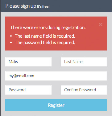
With this addition to the registration form and the addition from listing 1.16 to the routing file, upon incorrect input entry and form submittal the registration page would show the validation errors wrapped in Bootstrap’s “alert” class. Each error that occurred would be listed and previous input values would be persisted for the user:
This completes the conversion of the registration form HTML to a template compatible with Laravel’s Blade, with all benefits that Blade brings. This form in not perfect but it is enough to get the user to register and show what errors occur on registration. The login form needs to be converted in a similar way. Now that you know the process, you can convert the login form by yourself. In fact it has less fields so the resulting Blade template would be much shorter.
Converting the login form
As an exercise, please try converting the login form to Laravel’s Blade syntax by yourself.
Helpful Resources and Packages
The community around Bootstrap framework is amazingly big and creative. With framework’s growing popularity many tools and helpful utilities start to appear on the scene. There are many extensions of Bootstrap, such as:
- Websites loaded with Bootstrap snippets (http://bootsnipp.com and http://bootply.com)
- Date pickers
- Theme builders
- Drag and drop editors like http://divshot.com
- Button builder/Form Builder (http://bootsnipp.com/buttons and http://bootsnipp.com/forms)
- Ready to go templates, such as the ones on Creative Market
Let’s take a look at Bootsnipp and then learn about helpful PHP packages that make creation of Bootstrap compatible code easier.
Using Bootsnipp to get awesome Bootstrap code
You might have heard of my website called Bootsnipp. This website provides web developers with hundreds of Bootstrap code snippets ready to be copy/pasted to your application. Login forms, lists, panels, navigation and menu examples, sidebars, Bootstrap plugins, all of these could be found on http://bootsnipp.com and reused in your projects (all featured snippets are MIT license). Here is a small example of what kind of snippets you might find on Bootsnipp: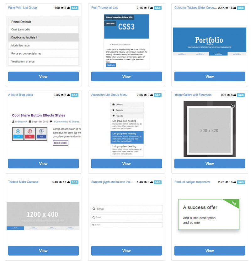
To use any of the snippets on bootsnipp.com just copy and paste snippet’s HTML and CSS into your template to get the snippet to work the same way as on Bootsnipp preview tab. Simple as that! Enjoy using it to find some great looking Bootstrap code snippets!
More resources on integrating Bootstrap and Laravel
- A starter site made with Laravel and Bootstrap : https://github.com/andrew13/Laravel-4-Bootstrap-Starter-Site
- Former, a package to make building forms easier (http://anahkiasen.github.io/former/)
- A blog post from Elena Kolevska on using Grunt, Bower, Laravel and Bootstrap together
Summary
By now you have a good idea on how to download Bootstrap or use Bootstrap CDN to serve Bootstrap HTML/CSS/JS framework to your users. You learned how to create an awesome looking registration and login forms by using the CDN, changing the look of those forms in an instant and making them responsive. Then you have learned the process of converting Bootstrap forms into forms compatible with Laravel’s Blade templating engine. Finally, you have looked at various resources that introduced you to the growing Bootstrap community.
In the next chapters of “Integrating Front end Components with Web Applications” you will learn how to integrate more components, libraries and solutions such as:
- Notifications
- Spinners
- Avatar Cropping
- Date Pickers
- Ajax contact forms
- Tagging
- Autocomplete and smart search
- AJAX file uploads
Ready?





Integrating Bootstrap HTML/CSS Framework with web applications http://t.co/n1U36bogjn
RT @msurguy: Integrating Bootstrap HTML/CSS Framework with web applications http://t.co/n1U36bogjn
Want to learn more about integrating @twbootstrap? Check this out, from Bootsnipp creator: http://t.co/44XbYTwcHz enjoy and share!
RT @msurguy: Integrating Bootstrap HTML/CSS Framework with web applications http://t.co/n1U36bogjn
RT @BootSnipp: Want to learn more about integrating @twbootstrap? Check this out, from Bootsnipp creator: http://t.co/44XbYTwcHz enjoy and …
RT @BootSnipp: Want to learn more about integrating @twbootstrap? Check this out, from Bootsnipp creator: http://t.co/44XbYTwcHz enjoy and …
“Integrating Bootstrap framework with Web Applications” http://t.co/pxdcEauWgF
Integrating #Bootstrap framework with #WebApplications – http://t.co/qaLCAoe2Xk
Integrating Bootstrap framework with Web Applications – http://t.co/jGcUPXkOHC
#Bootstrap
Integrating Bootstrap framework with Web Applications – http://t.co/tp3ijfo38K
Integrating Bootstrap framework with Web Applications – http://t.co/MB6Pa1VEOC
Integrating Bootstrap framework with Web Applications – http://t.co/VQgb1FWEOC http://t.co/RHqZS0SdNP
Integrating Bootstrap framework with Web Applications – http://t.co/RsIqYOGccF
RT @BootstrapStage: Integrating Bootstrap framework with Web Applications – http://t.co/RsIqYOGccF
Integrating @Bootstrap framework with Web Applications – http://t.co/Ye6r9eCff8 #webdevelopment #cssframework #bootstrap
Integrating Bootstrap framework with Web Applications – http://t.co/Zm8ahaCHwd
Integrating Bootstrap framework with Web Applications – http://t.co/mP5MBwrwAr
Integrating Bootstrap framework with Web Applications – http://t.co/O5Y8ByN8GT
RT @joehirstdesign: Integrating Bootstrap framework with Web Applications – http://t.co/O5Y8ByN8GT
Just ordered the book, hope it’s good
This looks good mate! I’ve been using Bootstrap for a year now, but not really implements a theme I was just contented with the default. There seems to be more of it here, tips and tricks. As soon as I get my card I’ll add this to one of my books to buy. =) Thanks for helping out!
Cool! Check out my website for Bootstrap snippets, Bootsnipp for more Bootstrap goodness 🙂 The readers of my blog get special pricing on the book, 20% off (see a link on the sidebar) so yeah, buy it when you can, I promise you it’ll be worth the money.
Hi there, is there a working demo file for the registration form. ? as when adding the two it does not look like the picture 🙁 “”When the HTML from listing 1.5 and CSS from listing 1.8 are put together, the registration form should look like the the one in the picture below:””
hello, I am beginner about laravel 5.So, I have many difficulities.Can someone help me by giving sample project for
laravel 5? Plz, help me!!!!
hello sir i m looking for music web app like gaana and wink or savn please kindly help me out for that thanks